太极图loading分享(纯css)
发表于更新于
字数总计:894阅读时长:4分钟阅读量:
更改pug文件
找到【blog】\themes\anzhiyu\layout\includes\loading\下的fullpage-loading.pug文件,进行以下更改。
1
2
3
4
5
6
7
8
9
| #loading-box(onclick='document.getElementById("loading-box").classList.add("loaded")')
.loading-left-bg
+ .loading-right-bg
+ .loading-bg
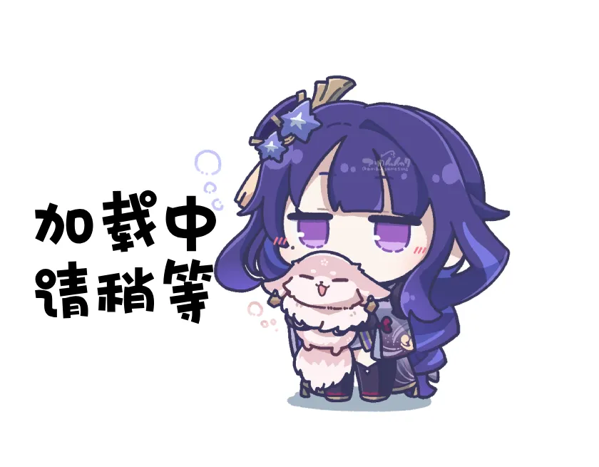
- - img.loading-img(alt="加载头像" class='nolazyload' src=loading_img ? url_for(loading_img) : "data:image。。。。")
.loading-image-dot
//- 加载的字体,可以不要
+ .loading-font loading...
#loading-percentage
|
修改style文件
找到E:\Documents\bingm\themes\anzhiyu\source\css\_global\下的loading.styl文件进行修改。
这里用的是最新版本1.3.1版本的主题,和旧版本存放路径不一样,旧版本存放位置在【blog】\themes\anzhiyu\source\css\_layout下。
1
2
3
4
5
6
7
8
9
10
11
12
13
14
15
16
17
18
19
20
21
22
23
24
25
26
27
28
29
30
31
32
33
34
35
36
37
38
39
40
41
42
43
44
45
46
47
48
49
50
51
52
53
54
55
56
57
58
59
60
61
62
63
64
65
66
67
68
69
70
71
72
73
74
75
76
77
78
79
80
81
82
83
84
85
86
87
88
89
90
91
92
93
94
95
96
97
98
99
100
101
102
103
104
105
106
107
108
109
110
111
112
113
114
115
116
117
118
119
120
121
122
123
124
125
126
127
128
129
130
131
132
133
134
135
136
137
138
139
140
141
142
143
144
145
146
147
148
149
150
151
152
153
154
155
156
157
158
159
160
161
162
163
164
165
166
167
168
169
170
171
172
173
174
175
176
177
178
179
180
181
182
183
184
185
186
187
188
189
190
191
192
193
194
195
196
197
198
199
200
201
202
203
204
205
206
207
208
209
210
211
212
213
214
215
216
217
218
|
if hexo-config('preloader')
.loading-bg
background-color: #20293a;
font-weight: bold;
line-height: 1.5;
animation: text 10s ease infinite;
display: flex;
width: 100%;
height: 100%;
position: fixed;
z-index: 1001;
opacity: 1;
overflow hidden
&:after
z-index: 1;
margin: 0 auto;
transform: scale(0.85);
filter: blur(5vw);
background: linear-gradient(270deg, #00fcbd, #7400f9);
background-size: 150% 150%;
border-radius: 50%;
animation: glowmation 10s linear infinite;
&:-webkit-scrollbar
display: none
#loading-box
position: absolute;
top: 0;
width: 100%;
height: 100%;
.loading-img
width: 100px;
height: 100px;
border-radius: 50%;
margin: auto;
border: 4px solid #f0f0f2;
animation-duration: .3s;
animation-name: loadingAction;
animation-iteration-count: infinite;
animation-direction: alternate;
.loading-left-bg
@extend .loading-bg
.loading-right-bg
@extend .loading-bg
right: 0
&.loaded
.loading-left-bg
transition: all .5s
transform: translate(-100%, 0)
.loading-right-bg
transition: all .5s
transform: translate(100%, 0)
.loading-image-dot
width 0
height 200px
position relative
left 50%
top 45%
margin-top -100px
margin-left -100px
border-left 100px solid #000
border-right 100px solid #fff
box-shadow 0 0 30px rgba(0,0,0,.5)
border-radius 400px
animation rotation 2.5s linear infinite
-webkit-animation rotation 2.5s linear infinite
-moz-animation rotation 2.5s linear infinit
transform: translate(-50%, -50%);
&:before
width 100px
height 100px
top 0
left -50px
z-index 1
background-color #fff
border-radius 50%
box-shadow 0 100px 0 #000
&:after
width 30px
height 30px
top 35px
left -15px
z-index 2
background-color #000
border-radius 50%
box-shadow 0 100px 0 #fff
.loading-image-dot:before,.loading-image-dot:after
position absolute
content ""
display block
.loading-font
width: 100%;
position absolute;
top: 70%;
color: #69d2e7;
font-size: 22px;
text-align: center;
animation: text 2s linear infinite;
&.loaded
.loading-bg
opacity: 0;
z-index: -1000;
#loading-percentage
position: absolute;
top: 67%;
left: 50%;
transform: translateX(-50%);
&::before
content: "「"
margin-right: 10px
&::after
content: "」"
margin-left: 10px
&.loaded
.loading-bg
opacity: 0;
z-index: -1000;
@keyframes loadingAction
0% {
opacity: 1;
}
100% {
opacity: .4;
}
@keyframes glowmation
0% {
top: -3%;
left: -3%;
background-position: 0% 50%;
background-size: 150% 150%;
}
12.5% {
top: -3%;
left: 0;
background-size: 70% 30%;
}
25% {
top: -3%;
left: 3%;
background-size: 100% 50%;
}
37.5% {
top: 0;
left: 3%;
background-size: 70% 30%;
}
50% {
top: 3%;
left: 3%;
background-position: 100% 50%;
background-size: 30% 30%;
}
62.5% {
top: 3%;
left: 0;
background-size: 30% 70%;
}
75% {
top: 3%;
left: -3%;
background-size: 50% 100%;
}
87.5% {
top: 0;
left: -3%;
background-size: 30% 70%;
}
100% {
top: -3%;
left: -3%;
background-position: 0% 50%;
background-size: 150% 150%;
}
@keyframes text
0% {
color: #7400f9;
}
50% {
color: #00fcbd;
}
100% {
color: #7400f9;
}
@keyframes rotate-clockwise-360
0% {
transform: rotate(0deg);
}
100% {
transform: rotate(360deg);
}
@keyframes rotation
0% {
transform:rotate(0deg);
}
100% {
transform:rotate(-360deg);
}
@-webkit-keyframes rotation
0% {
-webkit-transform:rotate(0deg);
}
100% {
-webkit-transform:rotate(-360deg);
}
@-moz-keyframes rotation
0% {
-moz-transform:rotate(0deg);
}
100% {
-moz-transform:rotate(-360deg);
}
|
说一下太极图大小控制,改动前把.box-taiji:before、.box-taiji:after、@keyframes这些属性注释了,以免影响你的操作。
- 改变大圆大小,动
.box-taiji属性下的height、margin-top、margin-left、border-right这些大小配置。 - 改变中圆大小,恢复
.box-taiji:before,改width、height、left和box-shadow的y偏移量,改变数值大小进行控制(只需要改中间的数值就可以) - 改变小圆大小,恢复
.box-taiji:after,改width、height大小后再改box-shadow的y偏移量先看到两个小圆显示,这里再改变top边距(这里left看情况微改)。 - 这里把
@keyframes恢复就可以了。